

Heuristic Models For App Design
Jakob Nielsen's 10 heuristics for user interface design with practical examples
One of the many challenges us UI and UX designers face before, during and after designing or improving a feature or page, is how to know if we're on the right path. While there are many methods to test your designs, "Jakob Nielsen's 10 heuristics for user interface design" are one of the must-does when designing, wireframing or evaluating a design.
As Harry Callahan says "Experience is the best teacher of all." So we will review the applicable heuristics with real-life examples of user experience projects we have been working on in Basalam.
1. Visibility of system status
"The system should always keep users informed about what is going on, through appropriate feedback within reasonable time."
For ins t ance, in a good check-out process, it's essential for users to know the list of steps to be carried out and which step they are currently in.
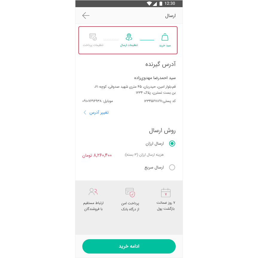
Understanding a system's current state is all about allowing users to feel and control. But bare in mind : "Too much information is distracting." So just let users know about the key pieces of information.
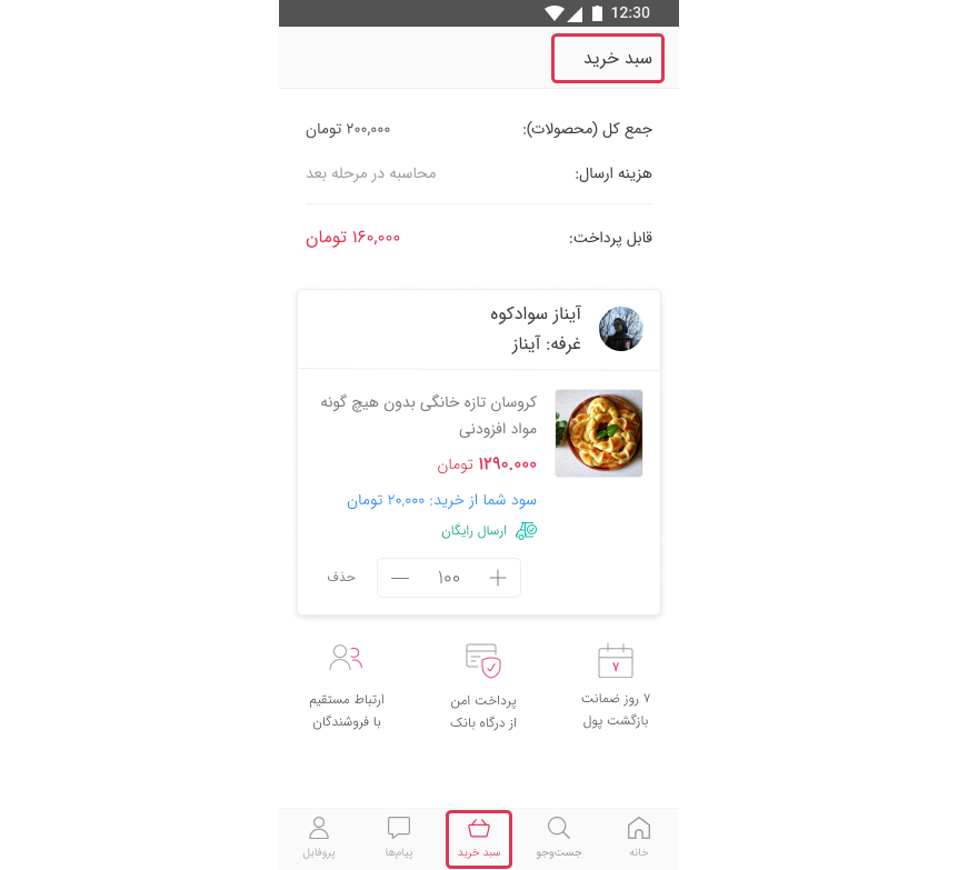
2. Match between system and the real world
"The system should speak the users' language, with words, phrases and concepts familiar to the user, rather than system-oriented terms. Follow real-world conventions, making information appear in a natural and logical order."
When you go shopping in a mall you put the products you are buying in a shopping cart or shopping basket as we call it in Farsi. Since e-commerces and marketplaces are the digital form of shopping, we need to simulate the exact real-life concepts in our design. So that's why we use the name and icon of shopping carts or shopping baskets in UI design.
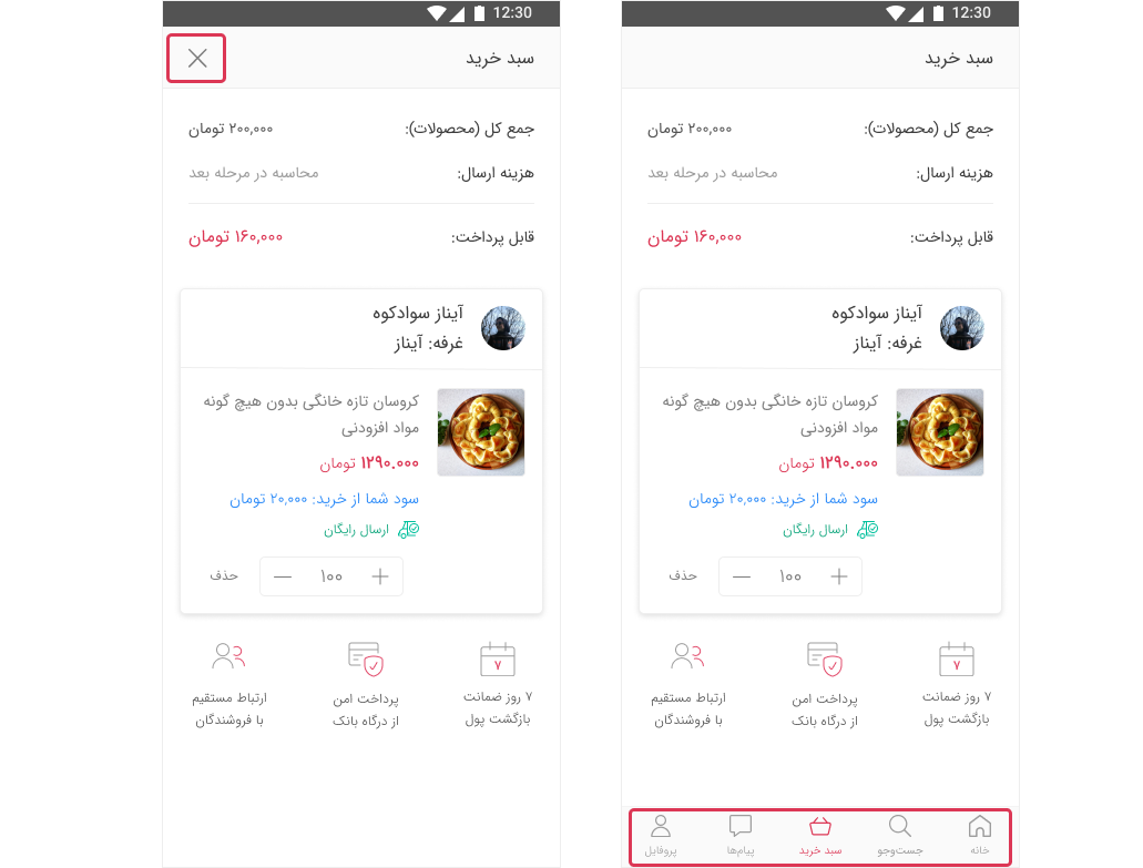
3. User control and freedom
"Users often choose system functions by mistake and will need a clearly marked emergency exit to leave the unwanted state without having to go through an extended dialogue. Support undo and redo."
That means the users must know if they make a mistake, they are not going to get stuck somewhere and feel in control of the system. In Basalam cart example, if the user accidentally clicks on the cart icon, users are able to click on other options in bottom navigation. And if you do not have bottom navigation, just simply provide close button.
4. Consistency and standards
"Users should not have to wonder whether different words, situations, or actions mean the same thing. Follow platform conventions."
There are two types of consistencies:
- Internal consistency: Maintain consistency within a product or a family of products.
- External consistency: Maintain consistency outside of products. Jakon Nielson's Law tells us that "People spend most of their time on sites other than yours". If all of those sites follow a consistent convention but your product breaks that, you're forcing people to learn something new. Unless you have figured out a new and better pattern, do not break conventions, because you are adding to your user's cognitive load every time you make them learn something new. So just do that when absolutely necessary. For example, in most Iranian e-commerce and marketplace websites, the shopping cart is located in the top left side of the header. So that is a convention to our users. If I change the location of the cart, users would be forced to look for it.

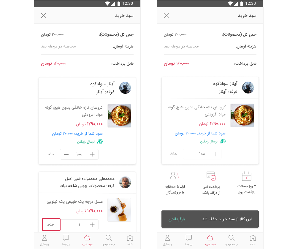
5. Error prevention
"Even better than good error messages is a careful design which prevents a problem from occurring in the first place."
So when looking at your design take the time and think of the issues that might cause error, then go down and look at things to prevent annoyance, frustration or forcing people to redo their work. Sometimes showing an undo message like "This item was deleted from your cart- Undo" might do the work. It's worth the interruption because you're preventing an accidental error.
6. Recognition rather than recall
"Make objects, actions, and options visible. The user should not have to remember information from one part of the dialogue to another. Instructions for use of the system should be visible or easily retrievable whenever appropriate."
Let's see what recognition and recall each mean.
Recognition: When you ask someone "Is Lisbon the capital of Portugal?", you are asking if the provided information is correct.
Recall: If you ask them "What is the capital of Portugal?", they would need a recall process to retrieve the correct answer from their memory.
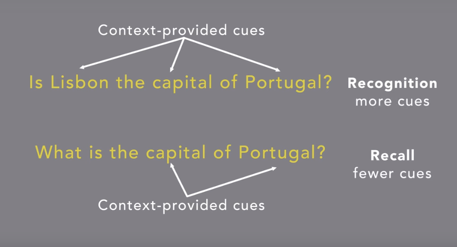
Memory retrieval is made easier when we get cues from the context. Interfaces that promote cognition give the users extra help in remembering information and minimizing user work is essential in good user experience.
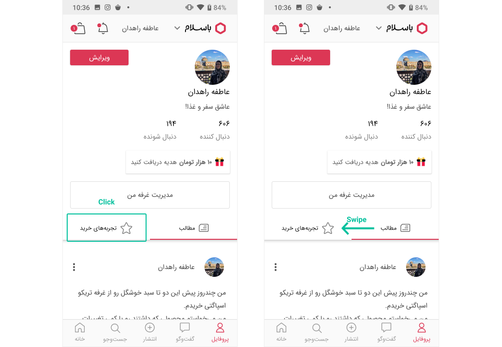
7. Flexibility and efficiency of use
"Accelerators — unseen by the novice user — may often speed up the interaction for the expert user such that the system can cater to both inexperienced and experienced users. Allow users to tailor frequent actions."
Whilst there are fewer accelerators in mobile web pages and application compared with desktop, one good example is swiping. In Basalam app's profile page for instance, users can switch between tabs by clicking on them or swiping.
Another familiar example is Instagram's double-tap. Instagram provides the heart icon for newbies and double-tap for more experienced users.

8. Aesthetic and minimalist design
"Dialogues should not contain information which is irrelevant or rarely needed. Every extra unit of information in a dialogue competes with the relevant units of information and diminishes their relative visibility."
It does not mean you have to use a flat or monochromatic palette. It's about making sure you are keeping the content in the visual design of your UI focused on the essentials. This rule is close to the Human Computer Interaction Signal-to-ratio.
Signal-to-ratio represents the ratio of relevant to irrelevant information in UI. Image , context, animation, anything that the user have to process could count as signal or noise. To improve efficiency of communicating information through designs and to help users complete their tasks, aim for a high signal-to-noise ratio. Every extra unit of information in a UI competes with the relevant units of info and diminishes their relative usability. As a consequence, it's important to prioritize your content and features. If something would be used infrequently or by a small number of users who don't contribute much to your company's goals, it might be a candidate for removal. The visuals, particularly graphics or photos, must support the primary goals of users or your company. In other words you should not have many visual elements that are not there for any other reason than to look pretty or to take up space. Communicate, don't decorate!
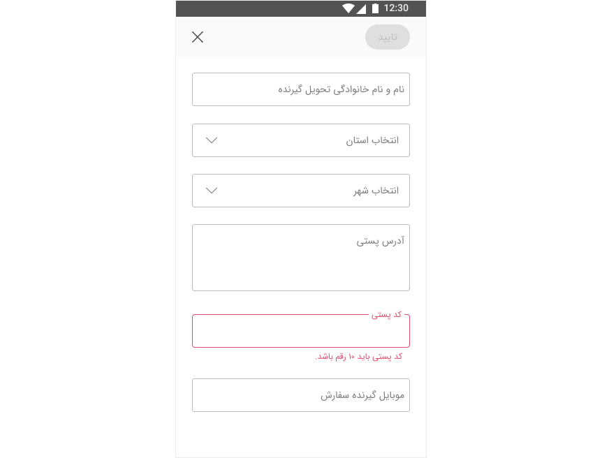
9. Help users recognize, diagnose, and recover from errors
"Error messages should be expressed in plain language (no codes), precisely indicate the problem, and constructively suggest a solution."
Helping users recognize, diagnose and recover from errors has 3 steps:
1.Inform users when an error has occurred with an error message. Depending on the context you can add visual treatments as well. In the page users need to add their address in Basalam's check out fennel for example, the zip code that the users need to enter must be not less than 10 digits or else the color of the box and the message below tells the user what kind of error has occurred.
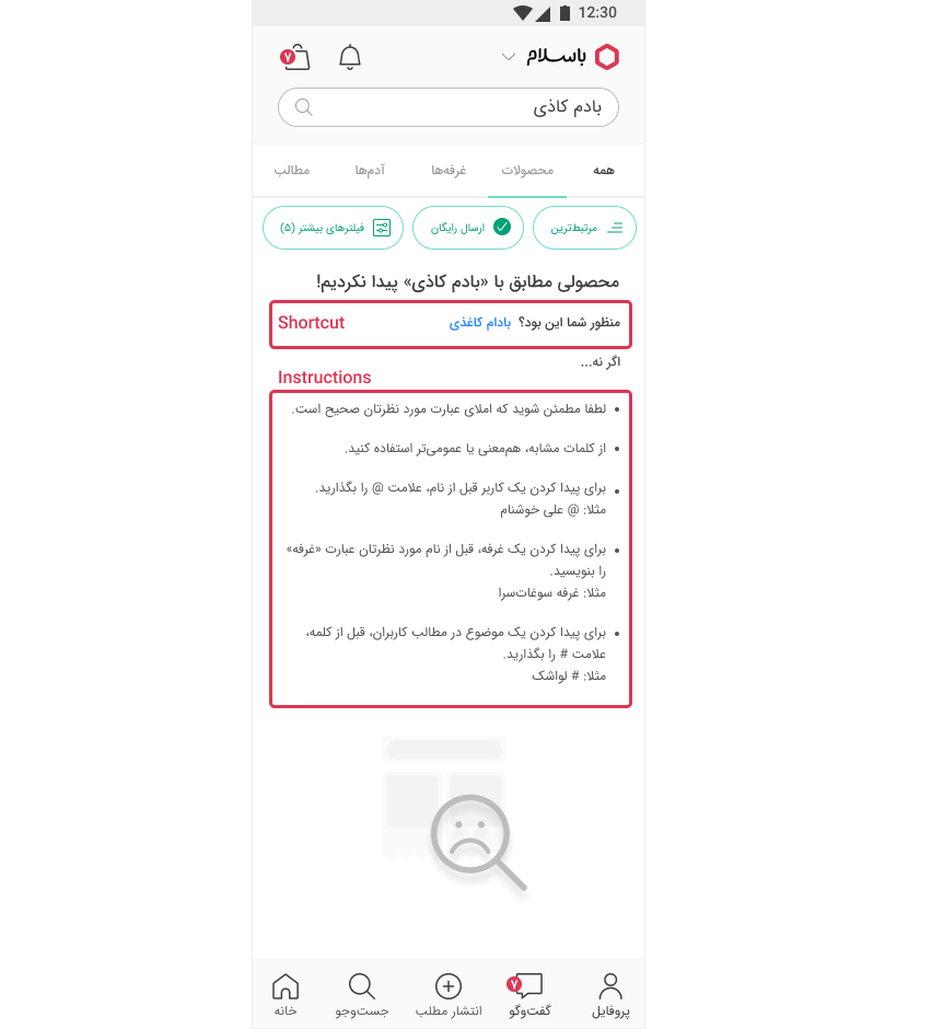
2. Tell the users what the problem is with plain language. The above example applies here as well. Another example is when searching a word in Basalam, if the search engine does not find any results for the entered key word, the result page simply tells you "We did not find a product named the key word."
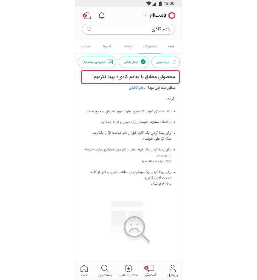
3. Offer users a solution. Provide shortcuts and links that they can click, not just instructions. In the search example, besides informing the users that the entered key word did not have any results, some instructions are provided to let them know what they can do about it and the search engine works. To make it even easier, the closest key word to the key word the user has entered is suggested as well.
10.Help and documentation
"Even though it is better if the system can be used without documentation, it may be necessary to provide help and documentation. Any such information should be easy to search, focused on the user's task, list concrete steps to be carried out, and not be too large."
While us as UXers strive to make products and services as interactive and easy-to-use as possible, sometimes users will need help. Help and documentation can come in many different forms like app onboarding pages, walkthroughs, tooltips, popovers, videos, etc.
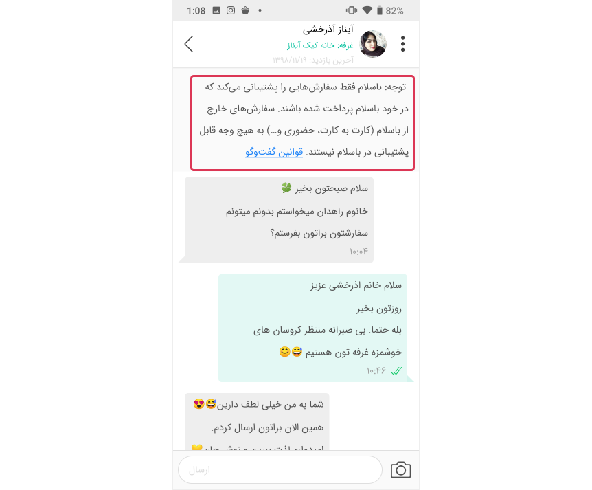
When messaging someone in Basalam, the main rules are provided on top of the page. A link to the entire messaging rules of Basalam is provided in case needed.
Heuristic Models For App Design
Source: https://uxdesign.cc/jakob-nielsens-10-heuristics-for-user-interface-design-3fe09af5fd99
Posted by: bedfordheaust.blogspot.com
0 Response to "Heuristic Models For App Design"
Post a Comment